Rebranding: American Airlines
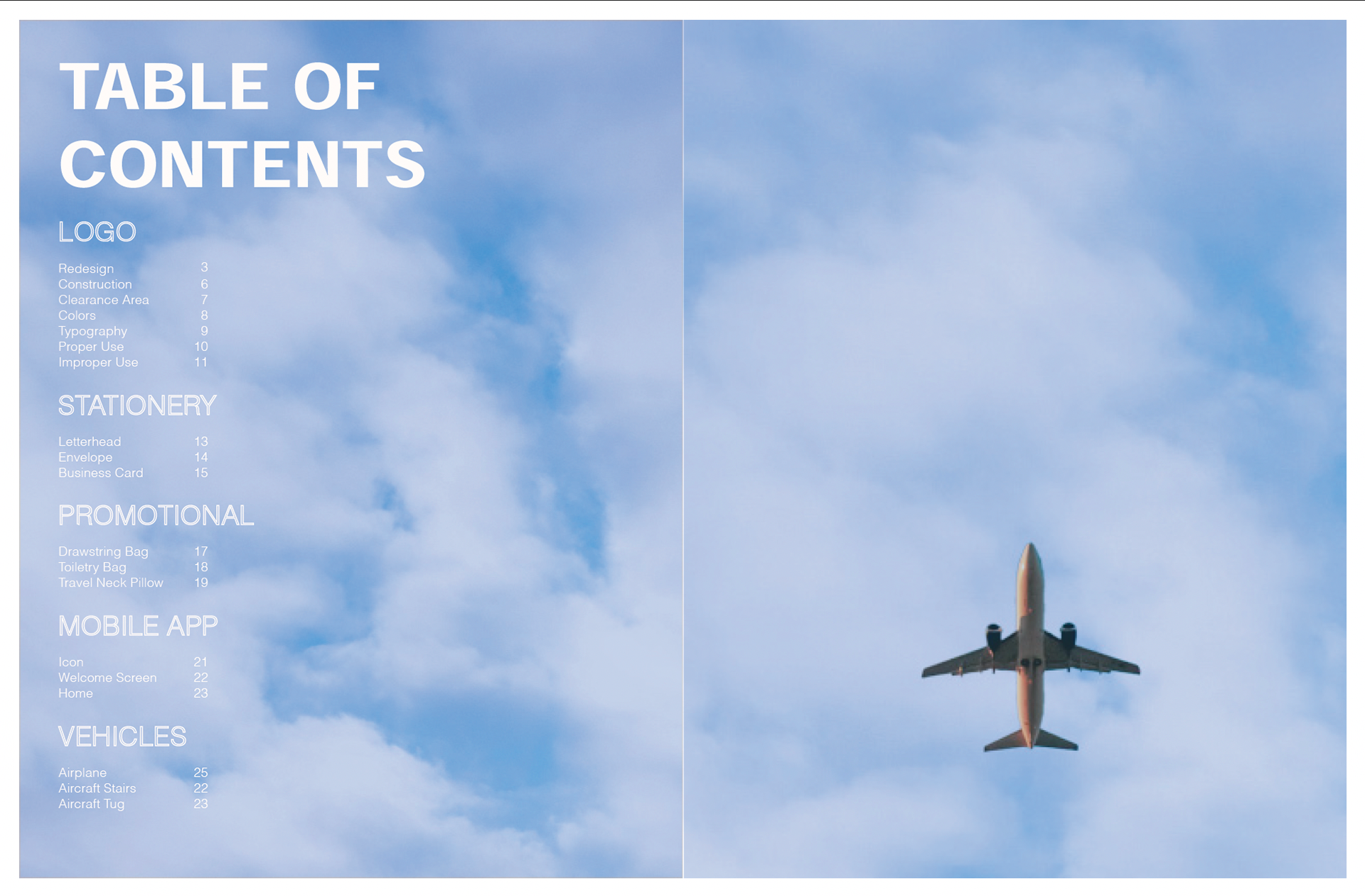
For this project I rebranded and made my very own Brand Guideline book. The logo, colors, and stationery's were all redesigned. An entire redesign for the mobile app was created along with new merchandise products and a new look to the aircraft vehicles.
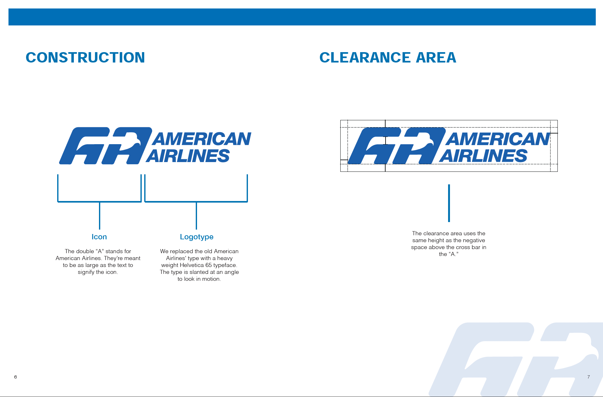
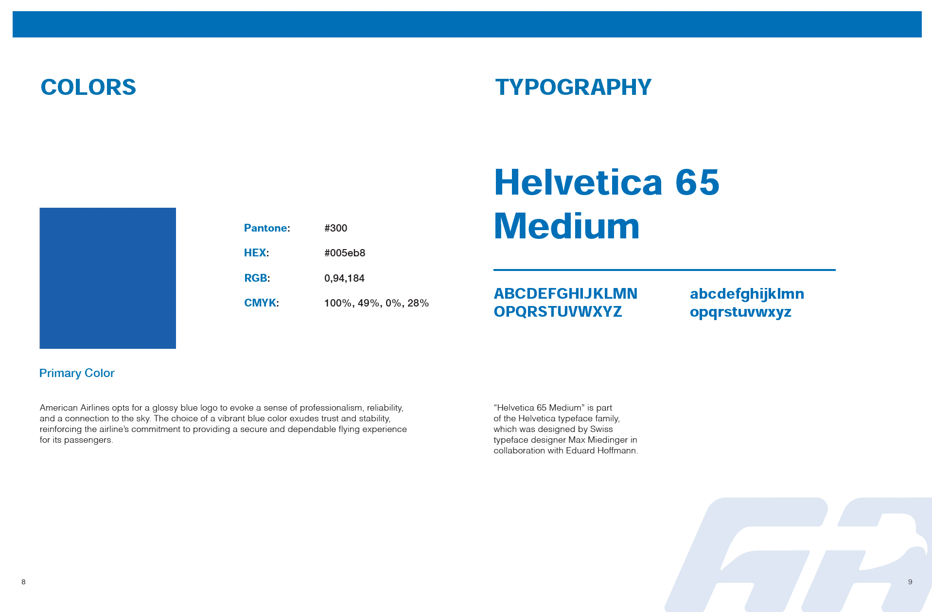
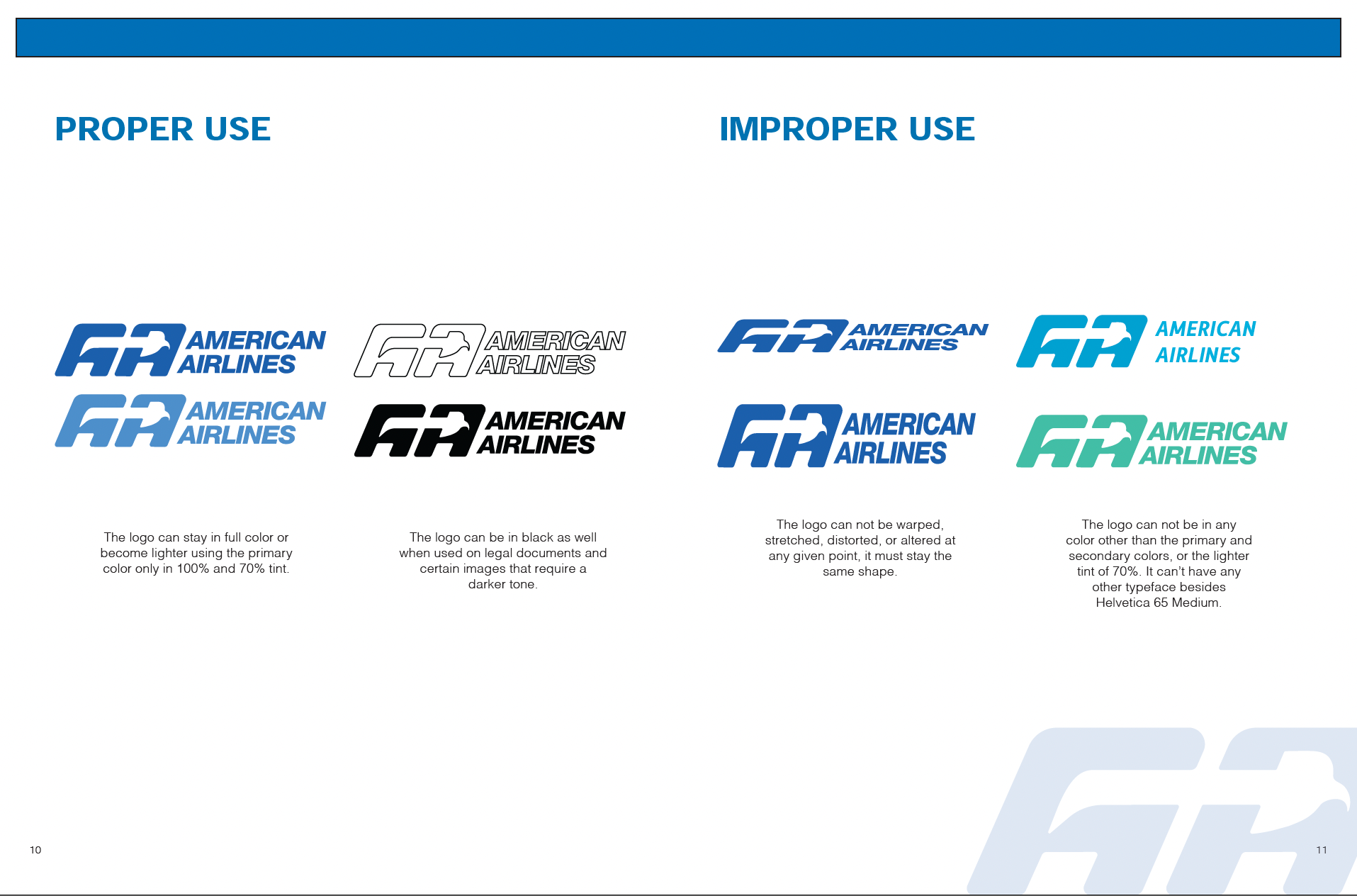
AA Logo Redesign
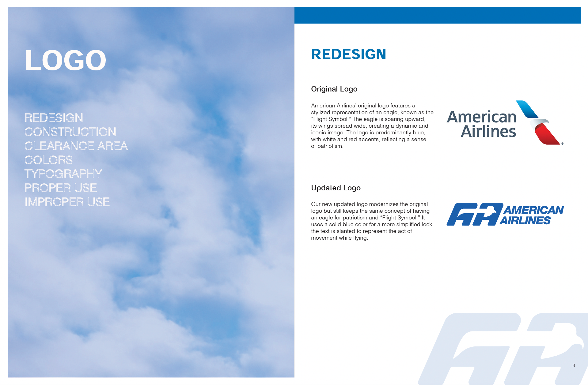
My initial idea was to use the eagle because it symbolizes freedom, flight, and American heritage. Their current logo already incorporates this concept but isn’t executed as effectively. I then considered simplifying the logo by shortening it to just “AA” and pairing it with various patriotic elements, like the outline of the United States or a bald eagle. Ultimately, I decided to combine these ideas and refined the design further, resulting in a solution that works best after a few tweaks.
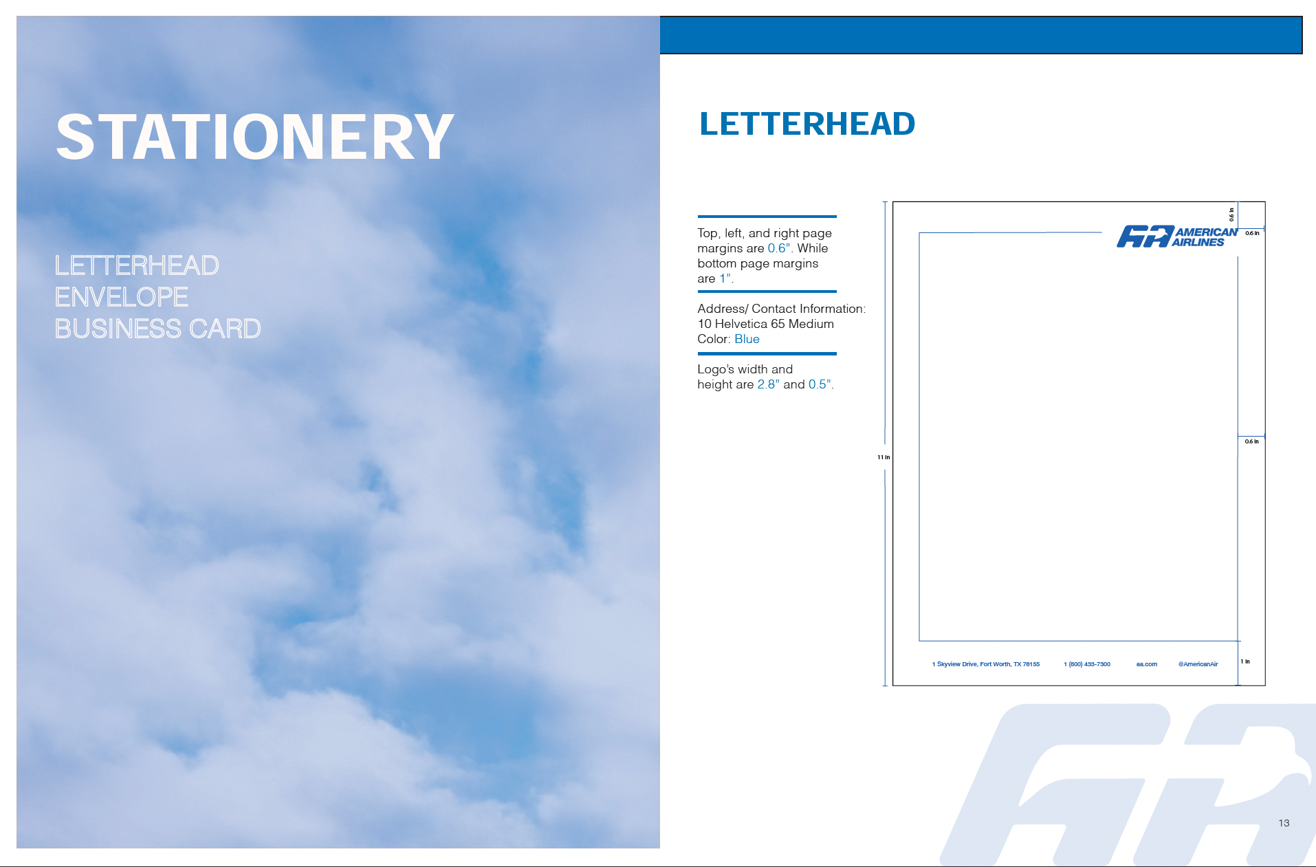

AA Stationery
Fully refined stationery including a new letterhead, envelope, and business card with the projects logo.
AA Promotional
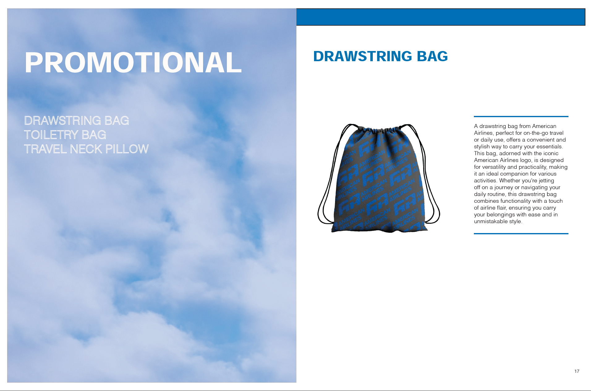
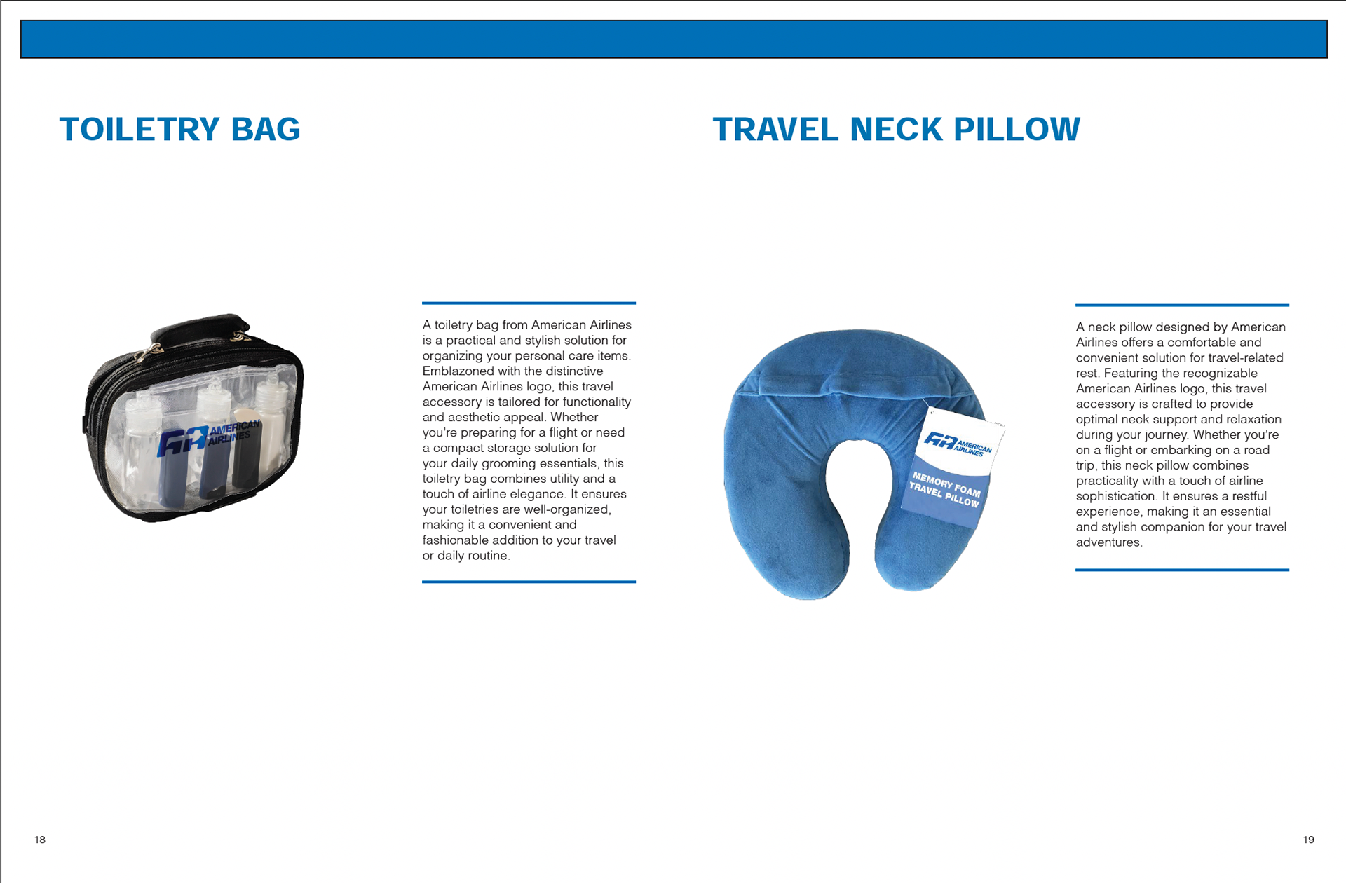
New merchandise was designed by modifying free licensed images while applying the new logo using blending effects.

AA Mobile App
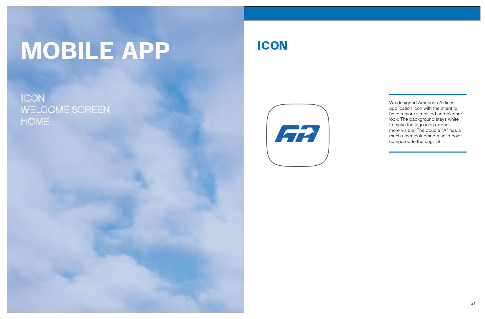
Completely redesigned app using bold bubble shapes as buttons and huds to modernize the look of the user interface.
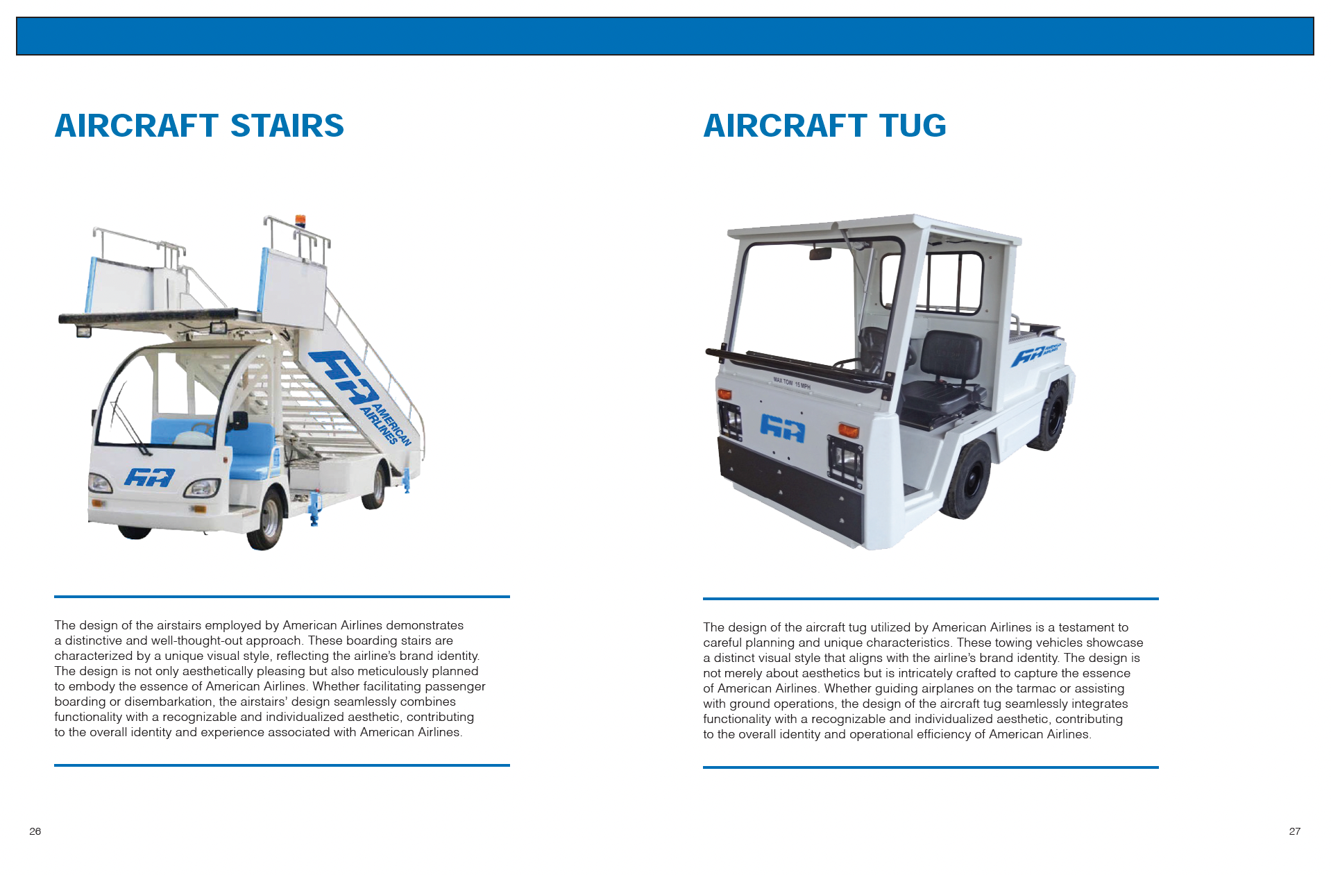

AA Vehicles
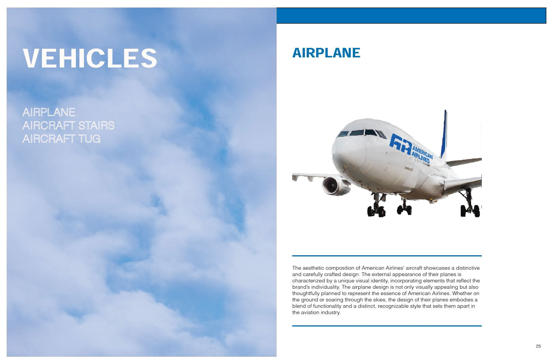
Newly designed vehicles you've seen around the airport using the new refined logo to expand on the project.
Senior Capstone: DDMARKET
DDMARKET is a dynamic pop-up shop showcasing a concept for my very own brand with a collection of my own designs inspired from streetwear and skate culture. Alongside the collection the shop also includes a brand guideline book and a set of point-of-sale posters that reflect my personal aesthetic.

DDM Introduction
Started off my brand guideline book with a cover inspired by modern day blueprints. On the next spread there's a short introduction of the brand with the logo being presented across the whole spread to add a unique look to it.


DDM Content
I started off my brand guideline book with a an organized table of contents to direct you. And then you are greeted to the brand values and strategic objectives in a easy to read format with cohesive brand colors.
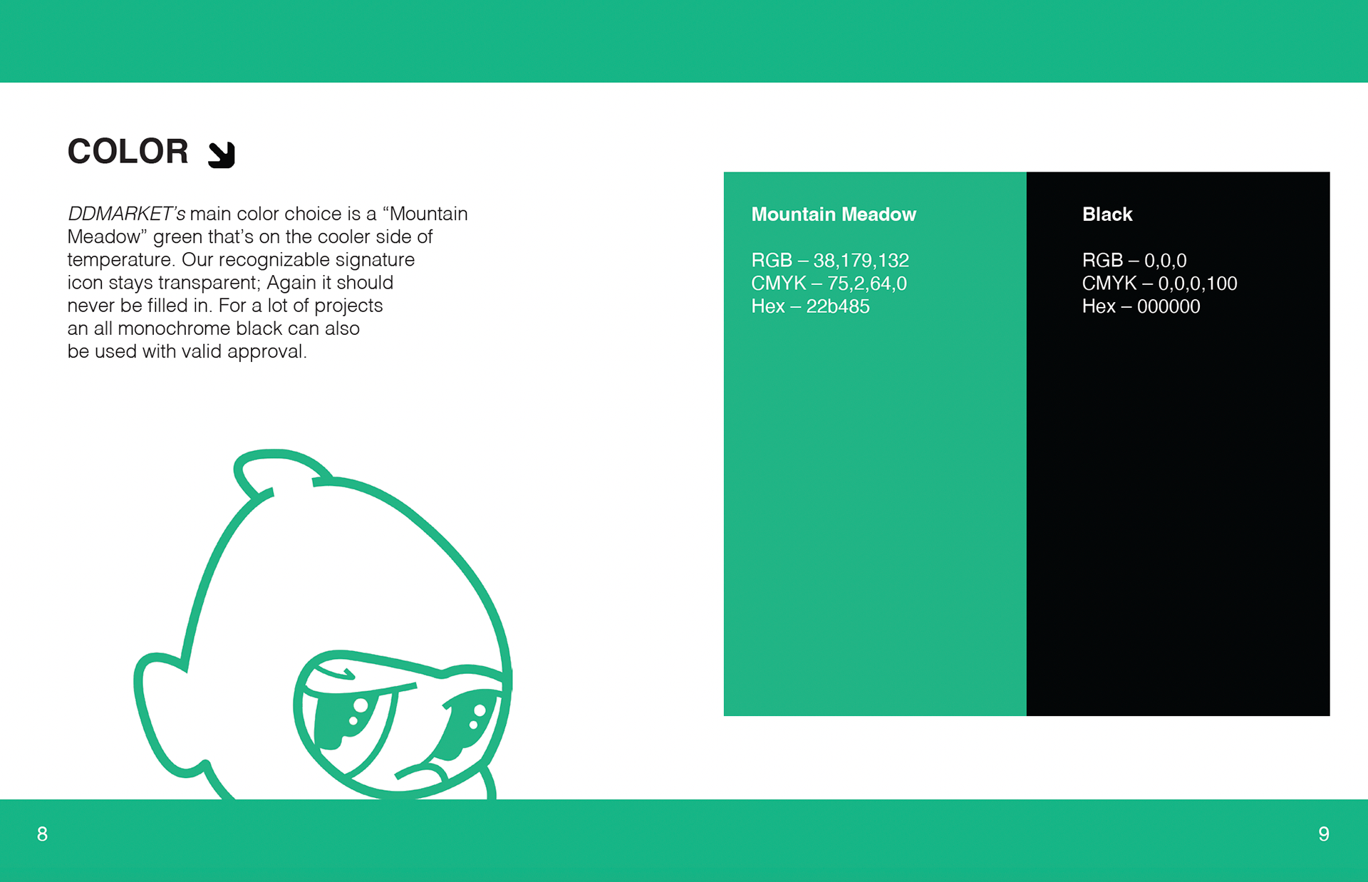
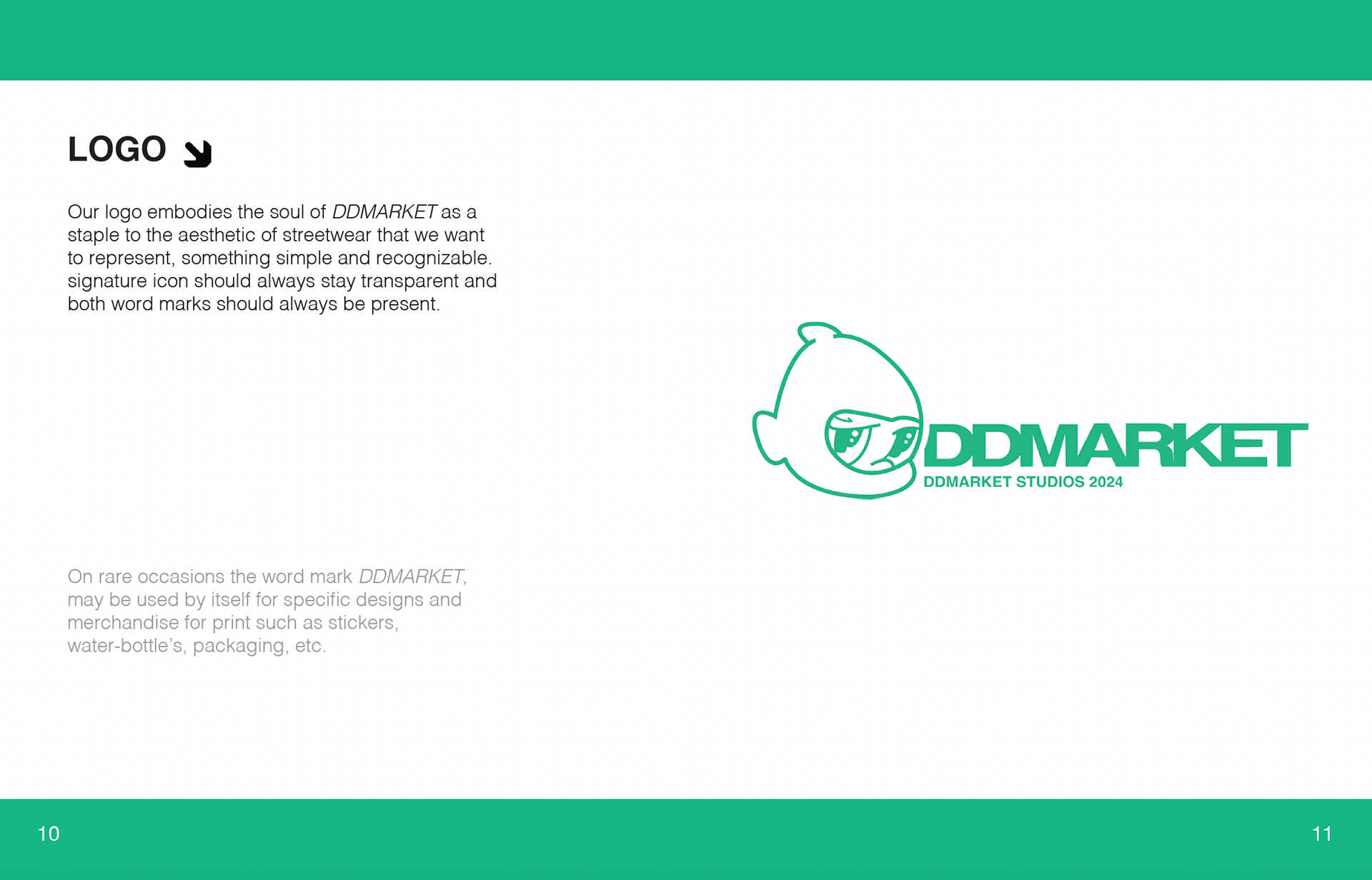
DDM Logo & Color
Logo I made of an illustrated character in a ski mask next to some altered text. And another spread to display the color scheme of my concept brand which was a Mountain Meadow green and black.
DDM Color Variations
Some different variations of the logo, all black, and inverted. Spread was meant to express how the colors are used for the logos and continue the cohesive layout of the guideline.
DDM Clear Space
Clear space using the letters "DD" in the letter mark of the logo as a measurement to add to the overall cohesive theme and color for the book.
DDM Improper Use
Designed this spread to show how not to use the logo. I used some bubble bracket shape and arrow vectors that I've used on other pages to continue the layout design.
DDM Illustrations
This spread was for an alternate version of the animated character used in the icon of my logo. It was meant to be used as a graphic to be printed.
DDM Typeface
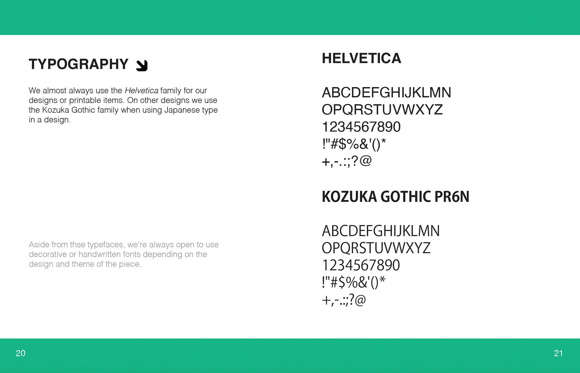
Simple layout for this spread of Helvetica and Kozuka Gothic fonts that are used in the prints and throughout the designs.
Personal Logo Design
A personal logo project inspired by early 2000 shapes and clothing. Also meant to showcase my use of vector layout and experiment with textures.
Personal Logo Design:
Personal logo's project I had created with the intention of promoting my freelance work. The designs were based on early 2000s graphics.
Personal Logo Design:
Personal logo's project I had created with the intention of promoting my freelance work. The designs are based on early 2000s futurism with inspiration from Japanese animation.
Freelance: Social Media
Designed a logo for local trading card collector's media page “ClimaxCardStudios” by using font, color, and imagery that reflects his brand identity.
Freelance: Car Detailing Business
Designed a logo for local car detailing business, “8Detailz” by using font, color, and imagery that reflects his brand direction and the client’s request.
Personal Logo
Logo I had designed to brand myself as a designer for cover letters, portfolio site, business cards, etc. The logo is also displayed here to resemble a chrome effect by using a combination of gradients and lens flare.
